Don’t we just love it when we can find growth hacks that can double our conversion rate? We all do that. In fact, we are always looking for hacks that we can use to tweak conversion rate even higher and get more profit. The reason behind CRO is that it isn’t about rules. You can hack it anyway you want because you do CRO on the landing page. And, landing page is your entity.
The good thing is that there are many ecommerce veterans that have successfully optimized the conversion rate of their websites. They have ‘been there, done that’ and they are our gurus. These include Brian Dean, Neil Patel, Matthew Woodward, to name a few. But, all these people have provided some amazing hacks to maximize conversions by optimizing the landing pages.
“Can You Convince The Visitor?”
One very important that you should ask yourself whenever you are designing the landing page.
Best Landing Page Hacks to Optimize Conversion Rate
In this article, we will discuss all these tactics to improve CRO on landing page, and what resources are needed to do that with ease.
So, without further delay, let’s learn how to improve conversion rate of our landing pages.
Can Hacks Help Improve Conversion Rate?
But before we start discussing these great tips to improve CRO, we have one simple question.
Can hacks improve conversion rate?
The answer is, yes and no. hacks alone can’t help improve conversion rates because it can depend on many factors. But, hacks can be used to test and improve the conversion rate by trial and error. So, the answer is both.
Best Tips for Improving Conversions
Back to the topic. These are some of the best tips to improve conversion rate on your ecommerce landing pages without worry.
-
Use Get in Your CTAs
‘Order information’ vs ‘Get information’ which one are you more likely to click if you were looking for information on a particular web page. Most people will say ‘Get information’ button. And, they are right. The reason is because ‘order’ has a negative connotation and people like to use ‘Get information’ because it generates more clicks and can easily lead to higher conversions of the website.
Similarly, check the below image.
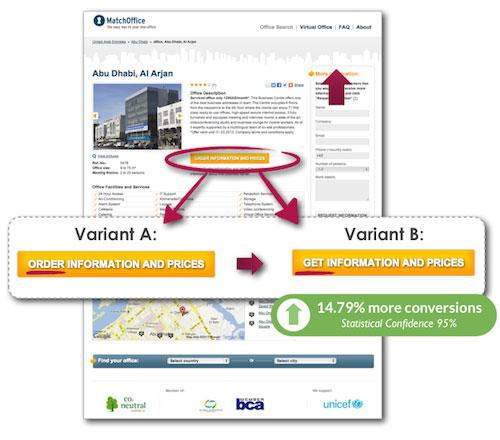 According to Crazy Egg website, the place where Get was used for the button, received 14 percent more clicks in comparison with the button where Order was used.
Companies prefer to let people make their own choice and using Get makes the request seems more polite. That’s why people often click the button because it gives them more freedom to choose.
Apart from the buttons, you can also use the same strategy for newsletters and ebooks or even any other product that you want to give the visitors.
Tips for Using Get:
- Make sure that it is only used when you are giving something to the customer
- A/B test Get on CTAs to make sure it has the best impact
- Don’t overdo its usage
-
Use the Right Images
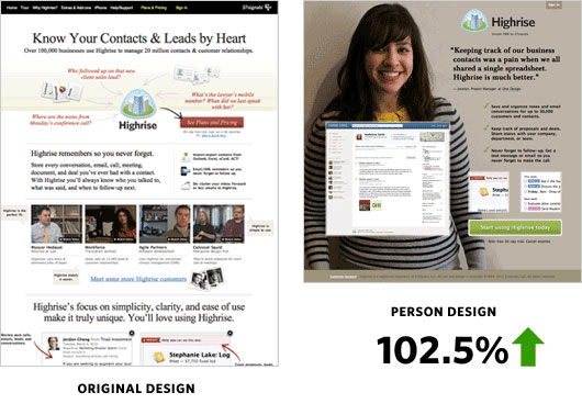 Humans love when humans are involved in the buying process. This doesn’t mean that you have to bring in real humans to make people purchase product, instead you can use pictures that make them trustworthy.
As you can see in the above image, the original design didn’t had an image in it. It was still a good design and was working fine. But when the design was changed to that of a girl in the background, the conversions of the
website increased by 100 percent.
Let’s have another example:
This time we will be using a hosting company to show how you can still improve conversions if you have the right type of images available.
 This is the image of a hosting company. As you can see they are showing a globe for selling hosting space. The conversions were low and the reason is quite obvious.
So, how did they improve the conversions on this landing page? They simply changed an image.

This is the new design of the website hosting landing page. They just added a lock instead of the globe and the conversions improve by 100 percent.
-
Use Pain To Create Need
Some of the best companies thrive on user pain points. They sell their products when they help the visitors remember about the pain they were having. Let’s say your product is about hair loss. So, if a visitor stumbles upon your product, what are the pain points that you think will lead to a sale? When you show a video of a person whose hair are falling and your product is the answer.
The visitor may become interested in your product and even if he/she doesn’t by at that time, you can ask them to provide their email address. This way you can bring them back to your site for purchase.
Another great strategy to focus on user pain points is by showing user testimonials. Testimonials are specifically written by the users of the products. They are an endorsement that the products you are selling actually work and are beneficial to the user. So, when a someone provides you a feedback, you can use that as a testimonial on your website.
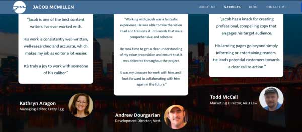 KlientBoost, a web development agency, says that the best testimonials are those that are written from a famous personality. This shows that you service is more credible and trusted. When you have testimonials of popular people, that’s like having golden geese. Because they ensure that you are great at your job.
-
Double Conversions with Upsell
Another great way to improve more conversions is by up selling to people who have already bought something. You can create a popup only for those people who have gone through the checkout process. WHen they reach the thank you page, which is after the purchase is done, show them a popup with an upselling offer. This offer should be discounted but similar to the first purchase they made. Let’s say they bought a fishing rod from your ecommerce store, as the upselling offer you can offer them a canoe, a life jacket, a can of fish food, more fishing hooks, or fishing wool. All these are similar to the item they purchased and also necessary for someone who is going fishing.
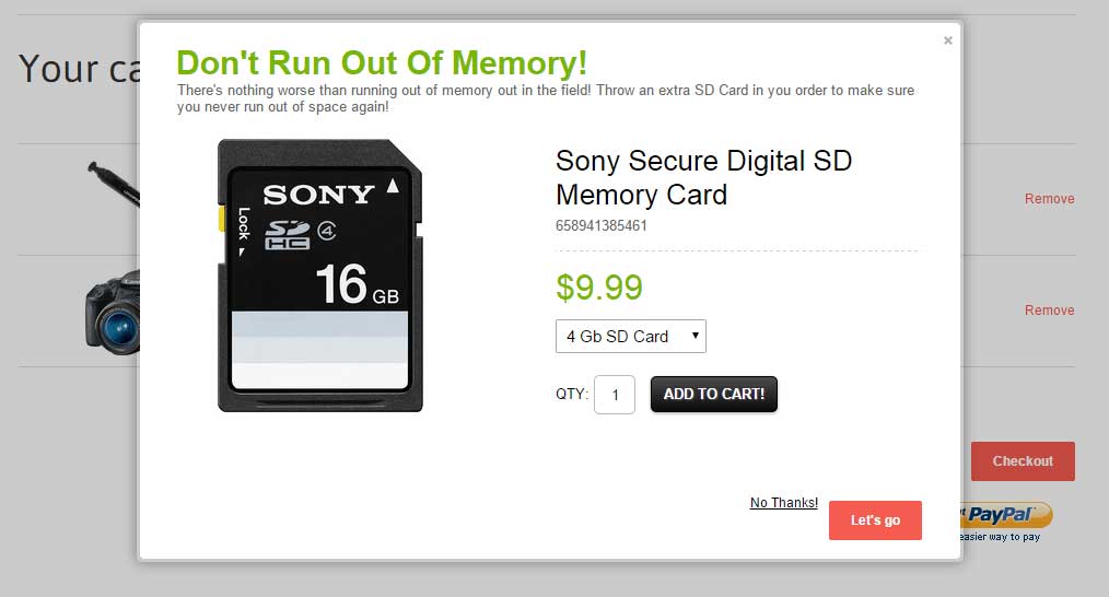 Now there are better and clever algorithms available that help people make more purchases pretty easily.
This is an example of how an ecommerce store is pushing products to people who are buying cameras from them.
-
Remove Weak Social Proof
Social proof plays a crucial role in the conversion process of any website. Let’s say your website has a landing page that has only nine shares. Now how will you know that it has been shared nine times? You have a social proof plugin available on the page.
While nine shares is a good start for a small ecommerce store, but if it is nine shares for quite some time, then that means less engagement. So, no one is going to buy from that ecommerce store. The best way to get rid of weak social proof is to remove that sharing box from the ecommerce landing page.
A good example of weak social proof is this landing page. As you can see, the landing page has only two tweets. So, anyone visiting this website with a buying intent will see that first.
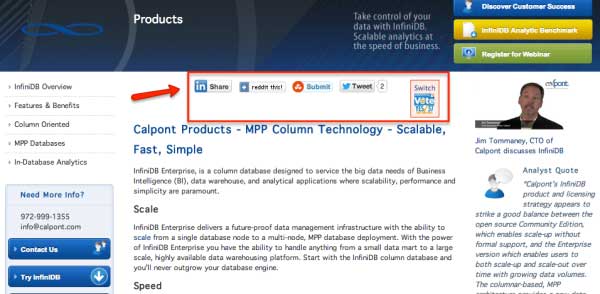 The surprising part is that Calpont, the company behind this landing page, decided to remove this social sharing box from the page. After a few days it saw an increase in sales inquiries.
Similarly, many product pages also have the social sharing button available. Check Amazon for instance.
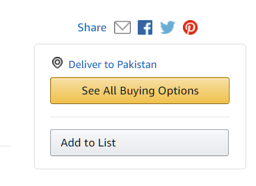 But it doesn’t have the share count available. This is fine. Because this way people will not become judgemental and will still buy the product.
-
Create Scarcity about Product
Sometimes companies create scarcity about a product to make it sell more. In fact, Wish.com has always some products that are going to expire in a day.
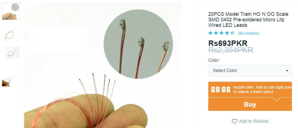 In the above image, check out how the store creates urgency about the product it is selling. It is asking the potential buyers to add it to the cart right now to unlock a lower price. In reality, the price will almost remain the same. There is only a slight difference in shipping costs when you buy from this ecommerce store. The reason is because it mostly earns profit from its shipping cost as it is a dropshipping store.
Even Amazon uses the same technique for products that it wants to sell more.
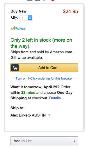 ‘Only 2 left in stock’ looks like a cliched line, doesn’t it? But it still works. In fact, this is one reason people buy more often from Amazon than any other website.
With that said, you can also add these types of products on your own website. For example, you can add a product countdown timer to your website. There are many plugins available on WordPress for WooCommerce based ecommerce stores. Some good ones are Page expiration robot, Thrive ultimatum, and Viral Signup.
-
Show uses of the product
One way to convert visitors faster than ever is by showing them how the product actually works. When someone is searching for a product online, they aren’t actually searching for a particular product, they are searching for products that can solve their problem.
One reason people visit AliExpress even if they are not going to buy from it is because it shows images and videos of the product in action.
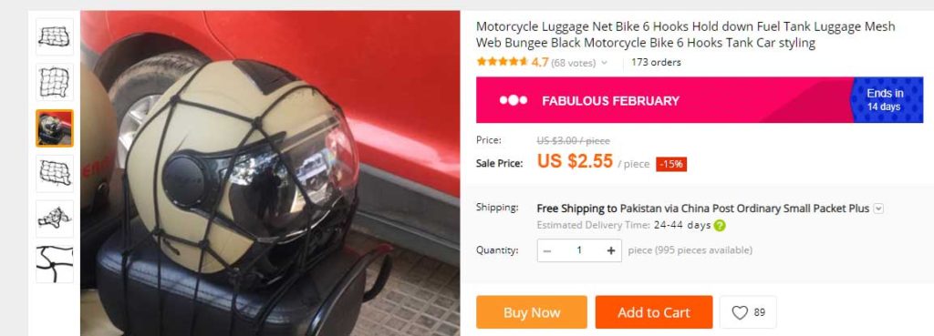 With a single image that doesn’t tell what the product is all about, user don’t get the real idea. However, when the product is shown with its use cases, they are willing to buy it.
Adding a video can double these conversions because visitors are more likely to trust the video then pictures.
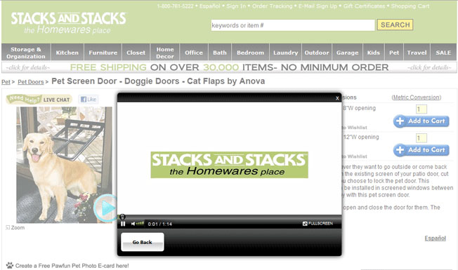 StacksAndStacks shoppers who watched the videos made 144% more sales than those who didn’t see the video – Source: Neilpatel website
-
Create Urgency and Stock Limit
Whenever Apple releases a product, on the launch day, people flock to the stores. Why? What will happen if they don’t buy the Apple smartphone on the first day or let’s say for the next few weeks? What will happen? Nothing. It won’t even make a difference in their lives. No one is going to come to them and say, ‘Ooh wow! You have a new iPhone, now your life is going to totally change.’ Nothing like that happens.
But… they still buy the iPhone.
The reason is, people like it when a thing is going to run out of stock. This concept also relates to the ‘scarcity’ concept that we have discussed above. But, if we ignore the ecommerce marketing part for a minute, the concept is built-in into our system.
It dates back to prehistoric era, when urgency meant to get food everyday. At that time, the hunters would have to hunt an animal before night, otherwise they would not be able to bring food home.
You see, this is coming to us from those genes. So, it is genetic and more or less applies to everyday activities of our lives.
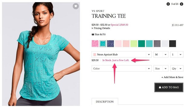
Now back to ecommerce. As a store owner, you can create urgency by showing a ‘limited stock’ option.
Take a look at how Victoria’s Secret is doing it.
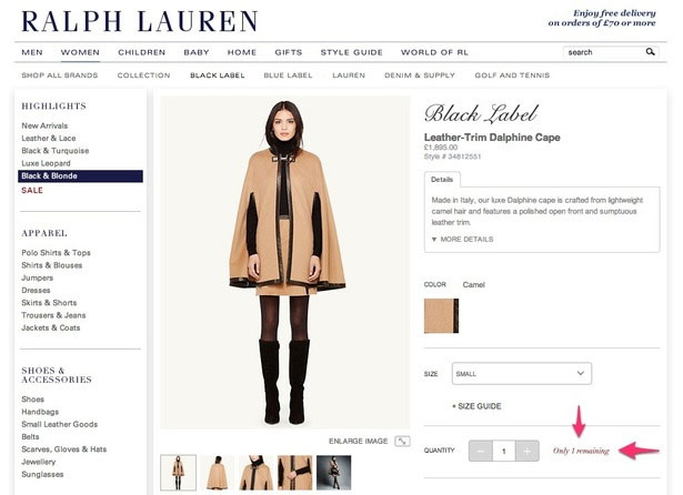
 Ralph Lauren, another major fashion apparel store, is also playing along with its own limited stock option.
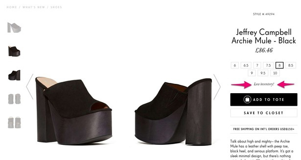
 Another prominent store in the same industry, Nasty Gal, has changed the wording a little. But the intent is still the same.
-
A/B Test each page design
The best way to check what is working on your landing page and what isn’t is through A/B testing. Not many ecommerce store owners have the time to test each design, and that’s fine. They can do the tests in real-time.
Take this example:
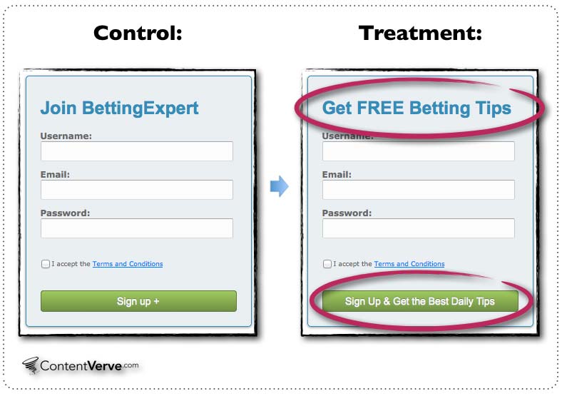 They just changed some text on the buttons and tested. The second one improved their conversions by 100 percent.
Let’s take another example of how you can improve conversions by simple A/B testing.
 Is there any difference in the above picture?
Everything is same, the email fields, the buttons, and even the headings. But the second form has the active cursor. This means the user doesn’t have to select the field, which is a major problem for many. He/she just have to start writing the email address to signup. Isn’t that easy?
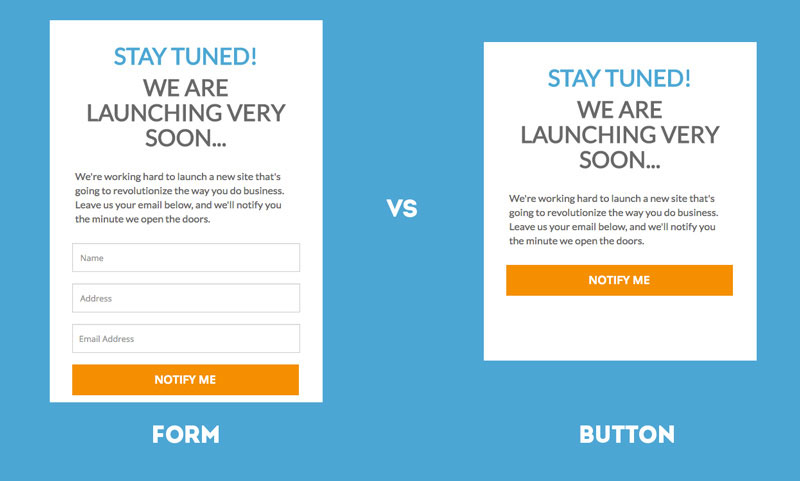 Which one is more likely to be clicked by the users? First is a form, and not many people like to fill forms. Second one is a button, and people love to press buttons. So the answer is obviously the second one.
You can test both types of designs on your website to see which one gets the most clicks.
-
Use Heatmaps and Put Nip in the Bud
Another way to improve conversions of your landing pages is by monitoring the activity through a heatmap. Heat maps are great way to understand user behavior on various pages of the website. You can add them to your product landing pages to understand user intent in a better way.
There are many patterns of tracing user behavior. You can even create your website in a way that it follows a particular pattern. There are two particular patterns that govern the UX world. These include the F pattern and the Z pattern.
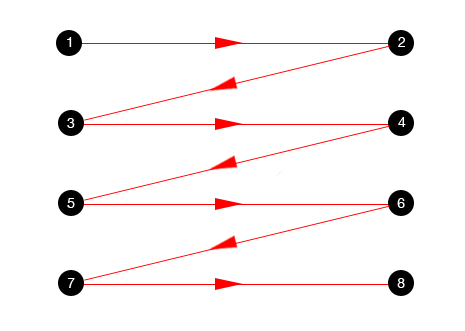 This is the Z pattern. Websites that are made in Z pattern have a heatmap along the zig zag pattern.
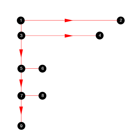 This is the F pattern. Websites made according to the F pattern follow the particular design.
 You need to make use of heat maps and eye paths to understand the areas that are most looked by the user and place the product prices and features accordingly.
-
Add product reviews that work
Let’s say you go for buying a product online. Will you buy the product from a website which has zero user reviews, or will you buy the product from a website that has 100s of user reviews? Obviously you will buy from the second one. Same is the psychology of each buyer visiting your ecommerce store. They want proof that the product was actually worth it. They are looking for information such as: Was the product delivered on time? Was it in one piece? Was it as described in the product description? Was it helpful to the buyer?
You can ask your buyers to leave user reviews so others can read them and get some level of satisfaction about the quality of the product before ordering.
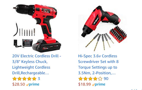 In the above image, we have two drills from Amazon. One has a only three reviews while the second one has 90 reviews. Which one do you think is going to sell more?
Point to note: Products that have more reviews and ratings get sold more on ecommerce stores because they signify that the store is authentic.
-
Pricing table with competition comparison
This is a pricing table of various web hosts available on a hosting review website. In your opinion, which one of these is going to sell more? The one with the lowest price right? There are two reasons this happens because users are always looking to get the most value. And, even if they are getting a little benefit in price, they will go for it. That’s why people are going to buy FastCommet hosting more than the other hosting services.
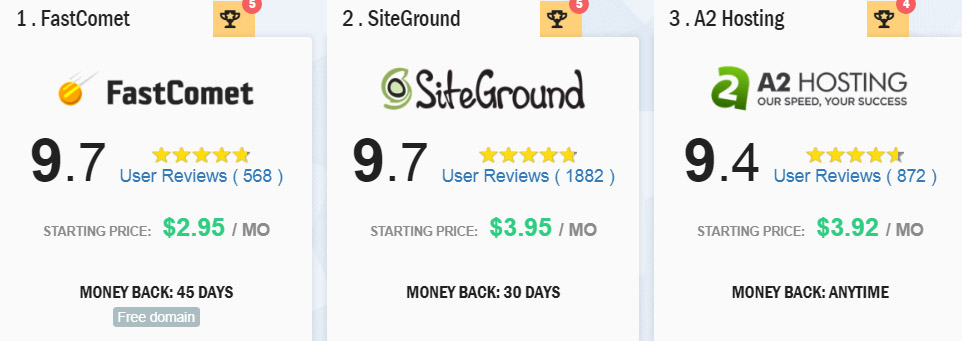 If you have competitors, then you can add a pricing table on your website mentioning the prices that they are offering for the product. You can remove their names so that it doesn’t provoke brand wars, but providing price comparison is a good option to increase conversions.
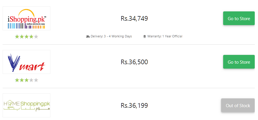 Above screenshot is of another price comparison website that provides comparison for smartphone prices. You can see that the lowest price is of the store at the top. These are some inspirations for pricing tables you can add to your own landing pages to improve conversions.
-
Exit Popups and Dynamic Text Replacement
Popups can help you bring back visitors who are bouncing off your landing pages. By strategically placing the exit popups with the right type of wording, you can easily convert those who are looking for a discount.
You can also change the popups by creating segments about various users. For example, you can create popups by location, by preference, demographics, and much more.
Another way to improve engagement on your website is through dynamic text replacement. But for this to happen, you need to know what is the name of the user.
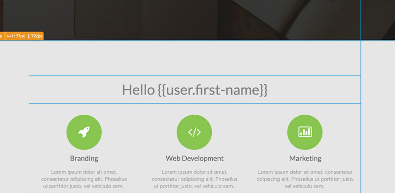 But if you don’t know the name of the user, you can use the things that are readily available.
For example, for an ecommerce store selling fashion apparel, you can tell them what the weather feels like in their area.
Let’s say a visitor is from New York, and it is raining in that area. You can say ‘it is raining, here are some cute umbrellas to keep you warm and dry.’
You might need some automation to do that though.
-
Start a Referral program
Another way to improve the conversions on your landing pages is by planning a referral program. You can get an affiliate membership software to start your own affiliate program easily. Simply provide a commission for each sale your affiliates generate for you. This will lead to more conversions and more profits.
In fact, if you are not sure how to get referrals, start cold messaging Instagram influencers.
Simply find influencers who have less than 10,000 followers and ask them to become your affiliates – if they are in your niche. This way they will promote your products and earn commission on sales.
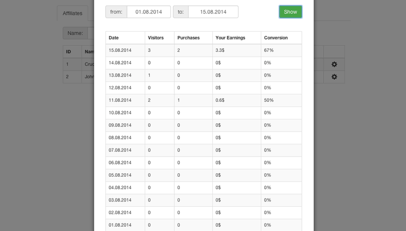 A screengrab of Affiliatly software
-
Provide Incentives to current customers
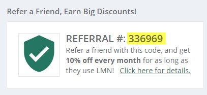
Email your customers to get discounts whenever they refer more customers. Provide your customers a referral code that they can use to bring in more customers and create a win-win.
Remember, you need to create a win-win so your customers have some incentive for referring others. This can be in the shape of a discount, or even store credit.
Many ecommerce stores are already doing this to increase their sales. And they are succeeding at it!
These are some of the best ways to improve conversions for your landing pages. If you adopt only five of these you are guaranteed to easily double your conversions.
Have something to add to this article? Why not pitch us about it.
